Spot colour.
Branding & identity.


Branding & identity.


Two spot colours have been used on this piece of design. The two colours together compliment each other well because the blue looks quite soft on top of the grey. The use of metallic inks definitely has a huge impact on the quality of the design because this means that the design looks a lot more high end.


Each of these pieces of design use three spot colours because one of the colours comes from a tint of another. The simplistic use of colour on each of the designs is what makes the impact of these labels so positive because the design stands out and doesn't look as though it's trying too hard to capture the attention of the consumer. The fact the colours relate to the flavour of the drink works really well too because the consumer tends to use colours association to find the product they are looking for.
Information & wayfinding.


One spot colour has been used here, orange. The way in which the orange has been brought into the design really makes it stand out and also contributes to the composition of the elements of this introductory pack. Orange and black together create a really sophisticated colour scheme and this works in favour the the pack created because quite often places are judged on the things they present to promote themselves. Also the fact the colour scheme is simple means that the information isn't compromised because theres nothing to overpower this.

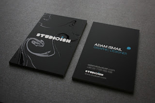
There are two spot colours here, white and blue. The use of blue and white on a black background works so effectively because it creates a stylish look for the business card. This particular colour blue looks good on black because its quite bold so stands out and adds a little something extra to the design. The business card is very much graphic designer-esk with the use of spot colour and spot varnish, it portrays the designer in a good light already before you even know anything about them.
Packaging & promotion.


Three spot colours, blue, pink and yellow. The use of three basic colours makes this design both masculine and feminine and the fact the colours are so bright and bold works in favour of the design because it means that consumers are more likely to spot the album when its on a shelf amongst other albums. I particularly like the different tones of blue that have come about in the clouds because they make them look almost real and as though they are set back in the background.

Three spot colours are used for the logo of fosters beer, they are red, yellow and blue. These colours work really well together because the yellow and red stand off the blue in a way which makes the whole logo look as if it has depth. The three colours together are also now recognised as part of a brand because Fosters is such a well known make of beer.
Publishing & editorial.


This design has one spot colour, blue. The use of blue and white together work really well because they can both be described as 'clean' colours so create very smooth and sleek looking design. The fact there are pages really heavy with blue and the others that have hints is also a really good design feature because it creates and interesting composition in terms of layout. The publication may have something to do with fitness so using blue seems like a good choice because its one colour that can be linked to health and medical centres.


There is one spot colour on this publication, this is red. The one particular feature that stands out with this publication is the fact that the name of the book is distinguished using the red spot colour on the correct words that can be found on the front cover. This works so well because the text doesn't have to be particularly large due to the fact the red on black stands out so well, so the design can still look quite elegant and sophisticated with the use of embossing too. The spine being red too creates a simplistic yet considered cover for the publication.
No comments:
Post a Comment