


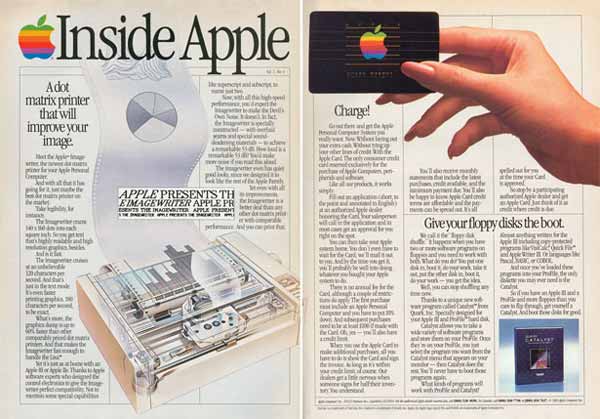


I came across this link with a huge range of Apple advertisements that have come about over the years, from some of the very first ones to some more modernised ones. This has proved quite a crucial part of research for my project because i'm creating my own advertising campaign and I want to keep some of my ideas uniform to that of Apples. A lot of the very first advertisements seem to include quite a lot of text which I don't find a particularly good feature because the consumer may take one look at it and decide that its far too much to take in. The later advertisements seem to be quite minimalistic with a lot of white spacing and less text, this seems more appropriate because it will send a definite message. This may be something I look at exploring when it comes to designing my own work. The other thing I found works really successfully with some of these advertisements is the hint of colour in the product because I feel this make the product stand out and seem somewhat more appealing. Overall the way in which Apple's advertising has changed over the years definitely moves with the times and the work here gives me a lot of scope when it comes to my own designs.
No comments:
Post a Comment