Packaging & promotion.


This is packaging that my perfume came in which has been foil blocked and then had a glossy varnish applied to it. These particular print finishes give the packaging quite a feminine feel because it highlights the design which is quite elegant and sophisticated. The fact the packaging is foil blocked also makes quite a cheap perfume seem of higher quality because consumers tend to judge something by the packaging it comes in, in terms of quality. The stock itself is quite a thick card and this is because it has to be quite durable when it is being transported to stores in order to protect the bottle inside and this also adds to the quality.

This is another example of packaging I got when I bought perfume. The one thing that was quite interesting to compare was the difference in quality between the two packaging pieces as one is cheap perfume and the other is higher end more expensive perfume. When you have the two side my side to compare this is quite obviously the higher quality of the two because there are more specialist techniques used and a higher quality looking stock. The stock is textured on the pink areas and then has a gloss finish on the black areas and the contrast between the two looks really good. This packaging also includes embossed text on the back and front in order to make the name of the perfume stand out, this factor is helped along with the use of foil blocking. The foil blocking is likely to be gold because gold is seen as a 'rich' colour and is a colour of value so it adds to the value factor of the product. The great thing about this particular packaging is that because there are so many different techniques used on it, its actually really good to touch and interact with therefor adding to the quality of it. The stock is again quite thick because it has to be able to protect the bottle and also when a consumer is paying a reasonable amount of money they will expect their product to be packaged nicely.


This particular design will have been die cut to then be made up into the shape it is. The stock will be quite heavy in order for it to last longer when being displayed in a supermarket and being handled by consumers everyday. It is however obviously not too heavy or it would have split slightly when put together. The stock although matt works really well with the inks when they are printed to achieve these bright, bold, eye catching colours that will draw the consumer in.

The particular part that stands out here is the labels on the sushi packaging. When seen up close they have an obvious texture which along with the font chosen looks quite sophisticated yet elegant as it takes some form of elegance to be able to consume sushi with it being a light food. The way sections of the packaging, only small, have been die cut in order for the product to been seen ever so slightly makes it more desirable because in a sense its teasing at whats actually inside. The packaging itself looks to have a spot varnished packaging and because this has been used on such a minimalist scale it adds to the sophistication.


This packaging has a matt varnish finish to it which seems to bring out the colours in quite a bold and bright manner, this benefits the product because it mainly uses colour to distinguish the different flavours of the coffee. The packaging will have been die cut once it has been printed and then put together by hand.


The packaging for the bottle has been printed on a plastic sheet that is then wrapped around the bottle. This plastic gives a shine to the design which links well with the texture and appearance of the bottle. The way the colour appears when printed onto the bottle is of high impact because they are really eye catching and bold.


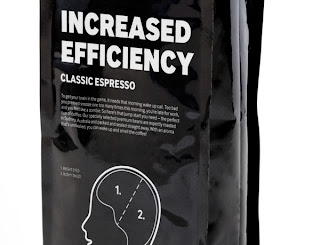
This design will have been printed onto silver foil roll that is then made up into these bags to keep the coffee fresh. The main reason for this stock option will be to keep the product fresh so that it lasts a long time. The options for this are limited because you can't really apply special finishes to it as such so the design is what has to speak to the consumer and make them want to buy the product.

The minimalistic design of this packaging is compensated for with the choice of stocks to create the box which holds the product. The choice of brown corrugated cardboard creates a good piece of design when mixed with the acetate because they both have visually interesting textures. The acetate looks as though it could be a bit thicker than the typical so it could be screen printed and its less likely to work properly through a printer. I'm not sure that the white text layout going over the white product is so successful however because it makes it harder to read, so this could mean the choice of stock could not be quite right.
No comments:
Post a Comment