
'Nike'
This is an advertisement for Nike shoes, generally aimed at the sports goer or an audience who likes to keep up with fashion. It works really well without the text because Nike are such a big company that people will recognise the logo found on the shoe and it means the shoes can speak for themselves. This could be found pretty much anywhere and could even be used as a poster due to its style. I've always found Nike advertising interesting because its so simplistic and innovative.

'Cradle' by Peter Callesen.
The work of Peter Callesen is amazing because he works both on small and large scale to create his pieces and a lot of patience goes in to paper craft. Works such as this don't necessarily need to have a purpose but are more there to be enjoyed and admired. They can however tell a story and make their audience come up with their own. The audience has to be imaginative yet paper craft can be enjoyed by anyone really because it's something different. The work of Peter Callesen can be found both indoors and outdoors (for the larger scale pieces). Some pieces are even large enough to fit a person inside! His website is worth looking at.

'Retro Futurism' by Sakke Soini.
This is another piece that is meant to be enjoyed, possibly in the style of a poster. This type of design is probably meant for someone who enjoys the simple things as thats why it stood out to me. It would work on a really large scale due to its simplicity because it's not overpowering in any sense. I've taken a massive liking to colour on a black background due to the interaction between the two.


'Nike ID' by Laura Alejo.
Again, looking at advertising for Nike but this time interaction with the product. These pieces are making the shoes seem more like a fashion accessory due to the change in style. The bold colouring makes them desirable and captures attention of a sport loving/fashionable audience. They could be found in a magazine but also could be seen as concept because theres nothing to say these products are trying to be sold. In particular the second image is quite clever because it shows the creation of the shoe.


'Ikea; long live diversity' by Charis Tsevis.
The concept behind the campaign is so simplistic yet it creates such a strong message. The concept is generally what drew me to this project. Its an advertising campaign for Ikea, promoting the fact that the store is for a diverse range of people so all should visit. 'Theres something for everyone' could be used to sum up this campaign. Essentially this campaign is for everyone with the message they are trying to promote but generally the home owner as you could furnish your whole house by visiting Ikea. These posters would be found on bus stop signs and on the subway, places where anyone and everyone can see them. I think the use of the items in the store to create the people is so clever because the items are at the end of the day, for the people.

'Wrigley's 5 (Cobalt)' by Peter Jaworowski.
This piece is an advertisement for '5' chewing gum so trying to make people desire this product and search for it, to buy it. With the chewing gum market being such a large one i'd imagine its quite competitive with companies such as Wrigley's so they'd have to come up with something completely different. The audience would be anyone who enjoys chewing gum and may be interested in trying something different. The design speaks for itself as the imagery surrounding the packaging looks cooling and refreshing, so no text is needed. This could be found in a magazine as a teaser add for the new product making the audience want to go out and try it. I feel the use of the colour on black background is working successfully again because the product stands out.

'Air yeezy tribute' by Fillipo Perin.
This is a different style of paper craft that is created digitally then made into a product once printed. I really liked these designs because they are sweet and just generally enjoyable. They don't necessarily have a purpose other than to be enjoyed by the person who created them and also other people. Again, something created for lovers of the Nike brand and people who may be a little obsessed with shoes! These pieces are miniature versions of Nike shoes and would be likely to be found in a gallery or exhibition if the artist chose to share them other than online.


'Capture the flag; urban flavours' by Mateusz Sypien and Nugenko.
This campaign was created to promote a key product (hats) for Urban Flavours. As well as the whole interaction between black and colour, this design stood out for me because they colours look as though they are glowing, giving the design an almost realistic touch. The audience is the fashion conscious as the company sell fashion brands and promote them. These images could be used across a wide range of elements; magazines, posters, in store decoration. Due to being visually interesting they will capture attention.
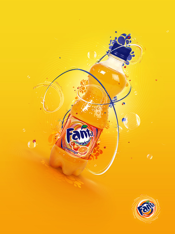
'Fanta' by Peter Jaworowski.
I was surprised with this piece at how well an 'orange' product worked on an orange background and felt in a sense this was a risk to take but has been excellently executed. This is an advertisement for fanta juice drink, and testing the desire to want it for the audience. The audience is very diverse because we are all consumers of drink but the style maybe suggested a younger audience as the advertisement may speak better to them. This could be found in a magazine or on a bus stop and works really well because the design speaks for itself without the aid of text.

'Paper game' by Zim and Zou.
This piece caught my attention because the style of the paper craft suits the style of the product; 'retro'. The fact its so neat and refined makes it really successful and almost real in a sense. This is to be enjoyed and could also promote a return of the product as more and more people are seeking out their old items. The audience would be anyone interested in gaming or even just the style of work because they'll appreciate the design. This is something else that could be found in an exhibition and could come under a wide range of categories. To create something like this must have taken time and passion and I like the fact its obvious from the final resolution.
No comments:
Post a Comment