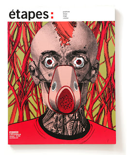
General editorial image which gives an idea of what type of imagery suits particular types of magazines. Gives me an indication of the direction my personal illustrations should take when it comes to designing.
Designs for Little White Lies. Different to the usual style found on the magazine as photography generally isn't a chosen media. I could use photography within my designs but feel this doesn't really represent what I want to get out of the brief. Just a general media idea.
Illustrated magazine covers. Indicates how the same magazine can still work across a range of different illustrative styles/imagery. How can I still make my work look like a collection as it does here?
Covers designed for the Little White Lies brief that I have written my own from. Gives me an idea of the existing styles that have already been done and the ideas that others have when they read the brief. Not too keen on the vector images because they all look a bit samey. The colours on these designs however work quite well because they are bold and strong.
Various different ideas for the black swan cover and how peoples ideas differ. Indicates a range of different media I could use for my own designs and which styles tend to work best. This shows me that the style completely depends on the type of film because the black swan is quite dark so therefor the imagery is too.


No comments:
Post a Comment