"Graphic design......simple and effective"


Urban Outfitters - www.urbanoutfitters.co.uk


Chuck Anderson - www.nopattern.com
These particular images are taken from the themepack collection "surreal territory" that was created for windows 7. All these images from this collection have the same specification of dark detail mixed with rainbow colouring but stand apart from each other. I find Anderson's work really interesting because of these two elements and the fact they work so successfully together.

Derek Hess - www.derekhess.com
I've always found Hess' work quite intriguing because a lot of it seems so sinister which makes me wonder what he considers when creating his pieces. The particular style of 'sketchy' lines he uses creates a definite atmosphere. I find his work successful in the sense that the pieces tend to be pretty simplistic but at the same time they have such deep meaning and bring about so many questions.

Urban Outfitters - www.urbanoutfitters.co.uk
This is a bag I picked up when out shopping one day. Im the sort of person that would purchase an item from a shop just because the bag looks good. For that reason this can be described as a successful simplistic piece of graphic design because theres not a lot to the design in general and its grabbed the attention of the target audience. I think typography can be brilliant when used in the correct way and this bag wouldn't have the same impact if imagery was used.

"watercolour"

"photo incorporated"
Stina Persson - www.stinapersson.com
I love the work of Stina Persson because its so brightly coloured and simplistic. My interest for this artist came about when doing a previous research project. She has a few different styles, my favourite being 'watercolour', which I feel make her successful because it means her work doesn't become repetitive. Her work is all fashion related and contemporary.


This corporate identity was design for a company called 'frappe nation', they wanted the logo to promote a newly published book on coffee culture. The logo was designed to be used on t-shirts and posters using the frappuccino. I think the overall design is really successful because the product is aimed at a certain target audience so they are bound to recognise such a simplistic shape/logo. The colours used give the overall design a contemporary look.

Mr Bingo - www.mr-bingo.org.uk
I love the style of Mr Bingo's work because its different to anything i've ever looked at before, its quite quirky and humorous. I feel his pieces are simplistic in the way that they don't include many factors in each one but then again the actual person/object in the piece is more detailed. I think the use of the white background makes the whole thing look very clean cut.


Mr Yen - www.mr-yen.com
Mr Yen's work is simple in the way that the ideas look but also complicated in the sense that they take time and a lot of concentration to produce. It has a positive impact on myself because looking at the work makes me want to purchase it and be able to interact with it. He has created a range of products available to buy such as bookmarks and notebooks. The concept he has stands out because they are unique.

This comes from the concept of using light to create shape and images. I think the reason I like work like this so much is because the colours make it really interesting to view. I really like the sketchy style of this piece and the fact its open for personal interpretation.

Shepard Fairey - www.theformofmoney.blogharbor.com
This is the type of design thats simplistic to have a greater impact. The colour and person present in the image make us aware of what its trying to say and the single word in each image is enough to show the meaning.

Skull Candy - www.karmakorma.deviantart.com
Although this piece looks quite complicated its simple in the sense that although theres a lot going on the image is just made up of shapes. The colour scheme also makes it quite simplistic. It also has a simplistic focus around this 'skull candy' logo.
"Graphic design.....is the effective delivery of a message, idea or concept through the use of visual language"

Derek Deal - www.derekdeal.com
The visuals used in this particular piece are communicating the type of music that the band pictured play. I can describe this as both successful and unsuccessful, this is because I have an understanding of the band already so I can link the music and imagery together but on the other hand it can be questioned that would someone who was completely unaware of the band be able to decide what genre of music they produce? I however, chose this piece because I found the mixture of photography and cartoon images work really successful together in creating an interesting image. Given the option, I would purchase this poster.

Liu Zheng - www.96K.com.cn
Generally phones can be quite a hard thing to promote through the use of photos but this particular artist has mixed the product with art as part of promotion for the company Sony Ericsson. This communicates successfully because I feel it would make people want to look closer at what is being promoted here and this is exactly what the company wants, to draw the audience in. Overall I find the work of Zheng really exciting to view because its so detailed and visually interesting.
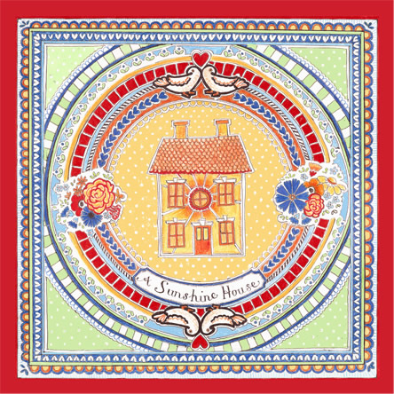
Sophie Elm - www.jeffjosephinedesigns.co.uk
Sophie Elm is someone I know personally so I feel as though I can relate to the work more closely, I can say that the work she produces definitely suits her as a person through both her personality and style. Although I feel this particular piece doesn't communicate a certain idea, it does communicate a warm and pleasant atmosphere. I think that the work is very 'feel good' when its viewed. The overall style is a mixture of contemporary and traditional and make me link it to the quote 'home sweet home' therefor the concept could be to create work that makes people feel a certain way.

This concept is all about showing graphic design in a more interesting way. I feel the style of the billboard makes it more memorable and will capture the audiences attention almost straight away with its 3D style. It sends out this message that so much music can be stored all in one place in a bid to make people desire the product.

Heinz tomato ketchup - http://www.funkadelicadvertising.blogspot.com/2008_11_01_archive.html
I thought this was a really interesting concept instead of just the obvious heinz tomato ketchup bottle. It must prove difficult to market such a product so this idea has thought outside the box. The caption and imagery also work really well together.


VW beetle cabriolet 2004 - //www.theinspirationroom.com/daily/2008/vw-beetle-cabriolet-colours/
I love this series of ads by VW. I feel that they present the car really well because beetles automatically link to a certain time period where we consider bright colours and even possibly hippies. All the designs are so simplistic but communicate to the audience that maybe there life could be bright and positive with this 'feel good' car.

This idea looks as though it spans from the word as though the designer has taken this first and considered all things that represent it. I think the use of colour has the biggest impact overall because we tend to link war to neutral colours as above. Its quite a complicated piece in the sense that it could have many different messages hidden within it.

Ed Hardy - www.edhardyclass.com
This piece targets a certain audience, maybe those interested in fashion and designers. However, if the label wasn't present it could also target someone who likes the 'punk' style. This tends to give the impression that if you have it you will be seen as a 'cool' person, this is because its a popular recognisable label.

This is graphic design put into a real life situation. I feel this works as design because a process was worked to come up with this idea. The concept is pushed forward through the use of colour.

Superdry
Shopping bags tend to have a concept in the sense that the company wants the audience to recognise and remember them. The Japanese writing and the font of the company text are part of this visual language.
"Graphic design......is a solution to a problem of communication through design"


Mission - www.clubmission.com
Posters are one of the most successful ways of solving a problem when it comes to communication. This particular one I have chosen is for a club night in Leeds. The problem being how can the club draw people in to attend this particular event. This problem has been solved using quite a simplistic poster design, I think the more simple the design is the better the impact will be on the audience. Its successful in solving the problem because they've chosen to include the most important information which will be better at attracting students as it doesn't take much to read it. The colours and fonts chosen give it an overall 'fashionable' look.
Apple - www.store.apple.com/uk
The apple logo is probably one of the most successful logos in existence. Traditionally the apple logo is white but its such a successful and simplistic design that even the image I have chosen above relates back to the same company. The problem here would have been how can the company create a simplistic yet interesting logo that would be recognised straight away worldwide. Its also successful because it'll work on many different scales.

Chuck Anderson - www.nopattern.com
This image is taken from a range of wallpapers created for absolut vodka. This is successful because it makes the product more desirable and captures attention instantly through the use of design. I like the way the imagery and colour mainly focuses around the product so this is where you automatically look first. This solves the problem of making a product look more exciting.

Chuck Anderson - www.nopattern.com
This is another way in which people can be encouraged to buy products, limited edition bottles. If I was to see this in a supermarket i'd feel more inclined to buy it because its not just your everyday average bottle and could be kept afterward as some sort of decoration. This sort of thing would also make ideal presents for people. Again the work of Anderson who seems to impress me over and over with his range of design and product.
Lauren Baker - www.tinysketchbook.blogspot.com
This is another poster design but this time aimed simply at students. Its successful in the way that it suits its target audience with being quite contemporary and 'fashionable'. This artist has an advantage with things like this with being quite young herself so she can relate closely to her target audience.

Su Blackwell - www.sublackwell.co.uk
This is another artist that designs paper cut outs but in a different sense as Blackwell's are more 'interactive' for example the book above that looks as though the butterflies are flying out of it. The designer has also used her talent of paper cutting to produce an advert for a wine company (linked above). This advert is the solution to a problem of how to hold attention through an interesting concept.


Sony Ericsson - www.sonyericsson.com
This is a further solution in making a product stand out and capture attention. I find this work looks very similar to that of Chuck Anderson that I very first researched. Generally Sony Ericsson tend to have these creative designs going on with their advertising campaigns which makes me believe they have the right idea when it comes to reaching their target audience.

Day of the dead celebration sugar skull - www.istockphoto.com
These skulls are linked to a certain culture and are often tattooed on people because of their design style and the fact they look good. They are a symbol of this culture so in a sense the design is solving the problem of people recognising this culture.

Paperchase
Design is used here to make the audience want to buy the product. Colour and imagery make the product desirable to a certain audience or person.

Bar Burrito
I think this solves the problem of the company making people remember who they are. The design on this bag makes it want to be the sort of thing that you will keep because it looks good and interesting which then also makes you remember the food place. The use of different fonts and point size make it a really good piece of design.
No comments:
Post a Comment