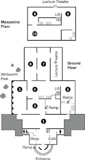
We'd need to come up with an exhibiton space layout so Fedrigoni would be able to understand what our ideas are for this part of the brief. I researched a few exsisting exhibition layouts so we knew what the best way to communicate the space layout would be in terms of using numbers and/or colouring coding. This actually proved quite a difficult thing to research because not many had been posted online, usually this sort of thing is quite confidential so doesn't need to be seen by anyone but the organiser. The main thing that stood out when looking at layouts was the use of numbers, this is a good way to communicate the layout because each person in our exhibition could have a number so we'd know exactly where everyone was going. At this stage though we don't know who would be part of our exhibition so I feel that the best way to communicate just a general layout would be to use colour and a key.


No comments:
Post a Comment