Showing posts with label OUGD203. Show all posts

Monday, 21 May 2012

Product/Range/Distribution; Packaging nets.


Instead of creating packaging from scratch or using a really basic idea I decided to research packaging ideas in the library. I found quite a few really good books with some quirky designs I thought could suit my t-shirt product. I've posted some of my favourites that I genuinely would consider using. Each could easily be altered to suit personal taste and to fit my product perfectly. Designs can also easily be applied to all of these nets. I want something that can be made quite uinque as my product needs to have that limited edition desirability about it. 

Books I used:
The big book of packaging prototypes & More packaging prototypes. 


Product/Range/Distribution; Packaging.

I took some books out from the library to get ideas for my own packaging. I felt making the most of the library was better because I was more likely to come across things I haven't seen. 

Clear packaging always looks quite modern and quirky because you can really showcase the product as well as adding your own unique design to the outside. Although I really like this I dont feel that it is appropriate for my t-shirts because this type of packaging tends to be more 'in store' so the products catch the customers eye. My products will be sold online and sent out to the customer. 

I really liked this idea of using a coat hanger to package the product. I've never really seen anything like this so it would be unique and you could create almost any outer shell for it if you felt it needed it. A design could possibly be added to the cardboard itself if it was relevent. 


Based on my idea the packaging for each of the t-shirts could include a key colour from the imagery, indicating the seperate ranges for the films as above with these candles. Different colours for different scents. 


I thought this was quite a quirky idea, packaging the t-shirts in context. This is again something I could consider based on key elements from my films eg. tangled packaging could be rapunzels tower etc. 


Packaging in a simple box and then using wrapping to make it uniqe. Quite a quirky and cost effective idea. Significant to what I am doing as it will have to be packaged apropriately anyway to be sent in the post. 

Books I used: 
1000 packaging designs & Packaging the brand. 

Sunday, 13 May 2012

Product/Range/Distribution; Little White Lies prints.


I looked at the existing Little White Lies prints to get ideas for the layout of my own and see how they differ from the magazine covers. They are pretty much the same image with a border included around the edge. 

Thursday, 10 May 2012

Product/Range/Distribution; T-shirt design.


I had a look at existing t-shirt design just to see how I could apply my imagery to t-shirts and get the best possible overall look. This mainly got me thinking about the colour I will choose for t-shirts because this could also be part of a range too but I can't really make a decision at this stage as I don't know what my imagery will look like. Most imagery on t-shirts tends to be centeralised unless it is designed specifically. 


Monday, 30 April 2012

Product/Range/Distribution; Little White Lies.


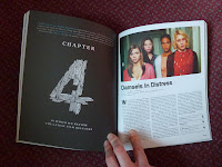
I purchased a copy of Little White Lies to get a feel for what the magazine is actually like as I wasn't that familiar with it. I could also see the quality of the stock the magazine was printed on because this is something i'm going to have to consider when printing my own work. I thought it was quite quirky how each section of the magazine is broken down into chapters based on what they are discussing. The magazine isn't just based around one film, it also includes reviews for new films and other topics revolving around film. The inside is both illustrated and photography in terms of the imagery so this brings it back round to the target audience as illustrations all the way through could have made it seem a little child-like. The quality of the stock is great because the colours look really bold and its quite high end so adds a sophisticated edge. The only downside to the magazine is the back cover, I personally feel that this doesn't seem to fit with the rest of the magazine at all so this is something I will consider when creating my covers. 

Product/Range/Distribution; Competition.

Empire is a British film magazine published monthly by Bauer Consumer Media. From the first issue in July 1989, the magazine was edited by Barry McIlheney and published by Emap. Bauer purchased Emap Consumer Media in early 2008. It is the biggest selling film magazine in Britain, consistently outselling its nearest market rival Total Film by over two-to-one and is also published in Australia, Turkey, Russia and Portugal. Empire organises the annual Empire Awards which were sponsored by Sony Ericsson, and from 2009 sponsored by Jameson. The awards are voted for by readers of the magazine.


In common with most British film magazines, Empire is populist in both approach and coverage unlike less irreverent and more 'serious' magazines such as Sight & Sound. It reviews both mainstream films and art films, but feature articles concentrate on the former.
As well as film news, previews and reviews, Empire has some unique regular features. Each issue (with the exception of issues 108 – 113) features a Classic Scene, a transcript from a notable film scene. The first such classic scene to be featured was the "I could have been a contender" scene from On the Waterfront.
The regular Top 10 feature lists Empire's choice of the top ten examples of something film-related. For example 10 Best Chase Scenes or 10 Best Movie Gags in The Simpsons. Readers are encouraged to write in if they disagree with the choices made.
The At Home section covers DVD news and releases; Empire's editors consider this section to be of sufficient quality to term it a magazine in itself, which is also relevant to the growth and importance of the DVD market, where sales can often outstrip that of box-office.
Pint of Milk presents celebrities' answers to silly or unusual questions, including the question "How much is a pint of milk?" This is intended as a guide to the Chosen Celebrity's contact with reality, and as such can be more informative than a direct interview, often reporting some surprising responses.
Each magazine includes a "Spine Quote", in which a relatively challenging quote is printed on the spine of the magazine. There are usually some obvious and obscure links from the quote to the main features of that month's edition. Readers are invited to identify the film source and the links to win a prize.
Kim Newman's DVD Dungeon is a regular feature in the At Home section, in which critic Kim Newman reviews the most obscure releases, mostly low budget horror movies.
Celebrity Mastermind is another regular in which a celebrity is given questions about the films they were in or they directed. Celebrities range from Quentin Tarantino and Christopher Lee (who are at the top of the scoreboard) to John Carpenter and Michael Keaton (who are at the bottom of the scoreboard).


Empire is one of the top mainstream magazines therefor this is what Little White Lies would be comeptiting with if my idea were real. This gives me an indication of what I have to do to top these designs and be completely fresh. 


Product/Range/Distribution; Editorial image.


General editorial image which gives an idea of what type of imagery suits particular types of magazines. Gives me an indication of the direction my personal illustrations should take when it comes to designing. 


Designs for Little White Lies. Different to the usual style found on the magazine as photography generally isn't a chosen media. I could use photography within my designs but feel this doesn't really represent what I want to get out of the brief. Just a general media idea. 


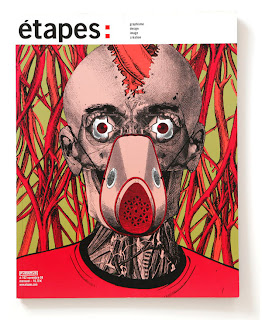
Illustrated magazine covers. Indicates how the same magazine can still work across a range of different illustrative styles/imagery. How can I still make my work look like a collection as it does here? 


Covers designed for the Little White Lies brief that I have written my own from. Gives me an idea of the existing styles that have already been done and the ideas that others have when they read the brief. Not too keen on the vector images because they all look a bit samey. The colours on these designs however work quite well because they are bold and strong. 


Various different ideas for the black swan cover and how peoples ideas differ. Indicates a range of different media I could use for my own designs and which styles tend to work best. This shows me that the style completely depends on the type of film because the black swan is quite dark so therefor the imagery is too.