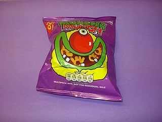
I reviewed the images i'd previously looked at in my colour theory sessions and because my given colour for this project was violet I focussed particularly on these images. The ones that stood out most were the yellow on purple and vice versa. This was a starting point for the direction I could take.
I also had to consider the shades of violet I was going to use in my imagery as there is quite a few, I could also use a range of these shades for a more visually engaging series of photographs.
Looking at the colour wheel showed me that violet and yellow were opposite therefor they would have good contrast and possibly present interesting results when photographed more thoughtfully together. This in a way made a decision for me in using two colours in most of my visual investigation.


No comments:
Post a Comment