Thursday, 22 November 2012

Illustrative type; top star wars quotes.

Quotes to use on my products.

I already had an idea of the quote i'd like to use for this film because there is one that's most famous but thought i'd research others just to see what else I had available to me. 


http://www.geeksofdoom.com

  1. “I suggest a new strategy, R2. Let the wookiee win.”
  2. “I’m a member of the Imperial Senate on a diplomatic mission to Alderaan.”
    “You are part of the Rebel Alliance and a traitor. Take her away!”
  3. “You’re all clear, kid! Now let’s blow this thing and go home!”
  4. “These blast points — too accurate for sandpeople. Only imperial stormtroopers are so precise.”
  5. “I’ve got a very bad feeling about this.”
  6. “You’ve never heard of the Millennium Falcon? … It’s the ship that made 

  1. “When I left you, I was but the learner, now I am the master.”
    “Only a master of evil, Darth.”
  2. “I find your lack of faith disturbing.”
  3. “Use the Force, Luke.”
  4. “You don’t need to see his identification … These aren’t the droids you’re looking for … He can go about his business … Move along.”
  5. “Help me Obi-Wan Kenobi. You’re my only hope.”
  6. “May the Force be with you.”   

Wednesday, 14 November 2012

The Wind in the Willows; bookshelf banner inspiration.

Just before I started designing my bookshelf banner for this project, I googled the title to see what existing banners there was. Originally I was thinking of a uniform, straightforward rectangle design but I found this image of bunting. This then gave me a really good idea, that I could use the bunting to create a banner but obviously personalise it with the characters I'd already created. I think this engages better with the target audience because it's quite fun and quirky and more so decorative so could be sold as a further product. 

Tuesday, 13 November 2012

Black and White Print; photos to apply products in context.


Originally I was going to apply my own design to these photos that I sourced from google images but I have now decided that all my products would be located on a stand in the middle of the shop so this is nescessary anymore. Collecting these photos however, wasn't all bad because they are a form of visual inspiration seeing as I'm creating products for this shop. 

The Wind in the Willows; Window displays.


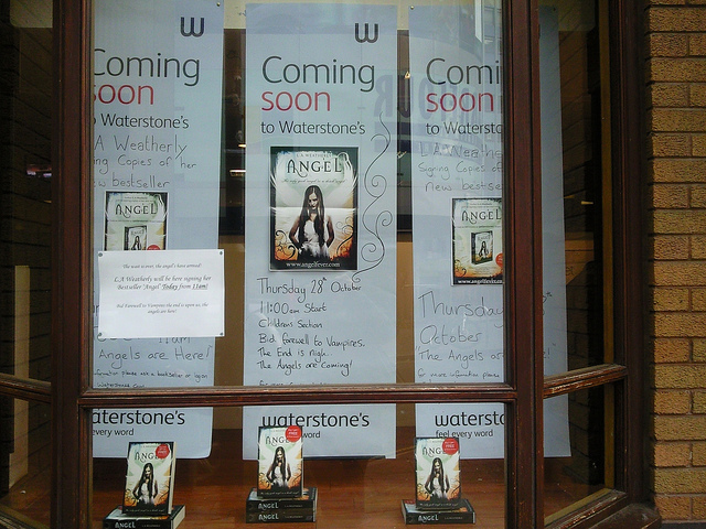
I wanted to look at existing window displays in order to get ideas for when I create my own to promote The Wind in the Willows. From the research it seems that a lot of promotional material mainly consists of the actual from of the book covers but scaled up to something like A0 in order to capture the audiences attention in the bookshop window. Some smaller bookshops tend not to use a single book for their display too so I could consider having different sizes of poster to work across the different places my product will need to be advertised. 

Monday, 12 November 2012

Black and white print; Paperchase.


Paperchase is the UK’s undisputed leader in innovative, design-led stationery, cards and gift-wrap. We have been around for over 40 years and are now firmly established as the top destination for customers looking for new and different gifts, cards and stationery.
Much of our merchandise is exclusive. We love to innovate so our collections are constantly changing yet all are specified to our high quality requirements. Visit our stores or online and each month you will find new arrivals – so for birthdays, Christmas and Valentine’s Day........indeed, for any occasion or celebration, there will always be new and different ideas to be found.
There are now over 100 Paperchase outlets in the UK as well as stores in Denmark, Ireland, Holland and the Middle East. You can find us in many House of Fraser and Waterstones stores as well as Selfridges and Harrods.
Our online store offers a large selection of our products across all our categories, including new collections and firm favourites.

Being a regular customer in Paperchase stores seems enough research in itself but I have researched the company further via their website just to see how they describe theirselves and whether what i'm creating is relevent enough to their brand. 

Thursday, 8 November 2012

The Wind in the Willows; visual research.


Lisa very kindly picked up this leaflet on the theatre version of The Wind in the Willows as a form of visual inspiration for my project. This has been a great help because it's further showed me a style that has been used and the sort of font that may work best as well as showing an example of colour pallets that can be considered. This is directed a such a wide target audience with both adults and children so I need to remember this as my own designs mainly need to speak to the children more so than the adults.

The Wind in the Willows; childrens illustration.


I looked at children's illustration as a main focus for my brief because I think the imagery is what is going to speak to the children most when they see the book on the shelf. I've noticed that a lot of work tends to have a very unique hand rendered look shining through from each illustrator so I need to consider how my style will stand out from whats already existing. Vector imagery also seems to be consistent through the research just because the is a current popular style and makes things look very cartoon-like which also speaks to the target audience. Watercolour consitency has also began to inspire me because I feel this style still speaks to the target audience but has an element of sophistication to it which I really like. It'll also be a new technique for me to work with if I do decide to go down this route.